What video game designers can learn from Paper
/Paper
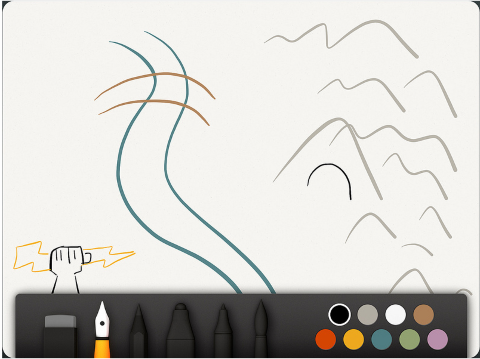
Paper by FiftyThree is an iPad drawing app that has garnered a lot of attention since being released. It has won numerous awards as well as the prestigious Apple's App of the year for 2012.
I want to talk about how videogame designers can learn a lot from Paper. No, I'm not talking about using it to create Keynote slides or anything like that. I'm talking about the actual design choices they have made and how it relates to videogames.
Do One Thing and Do It Well
Paper launched the same day the iPad retina was released. It had the benefit of looking beautiful when people were looking for apps to show off on their new device. The Verge even went so far to say it was the Instagram of drawing apps. With or without skill your drawings were going to look better than ever before.
It broke tradition in comparison to other drawing apps which overwhelmed the user with tons of choices. Which type of brush to use, what size of the brush, what color, etc. Paper launched with a lack of options. A free app that only gave you pen and a handful of colors to play around with.
When it launched it also was one of the first apps to attempt In App Purchasing and not be a game. The IAP was for the various 'tools' that the user could purchase. One of the great things they did with this was really call out each individual tool (Draw, Sketch, Outline, Write, and Color) as something special. People wanted to own all of the tools because they felt unique and different from one another.
This is something we as designers have done a bad job of - although we are slowly getting better. Name things! Build things up so that people want them. The 'Boomer' in Gears of War is no different than most enemies in games but he is built up, has a cool name, etc so that people remember him. Same with Clickers and Bloaters in The Last of Us. Take the time to name things in your game and make everything feel special and important. Think about how they would all make cool action figures and play sets.
Another great thing they did with their IAP is give the user a place to actually try the tool before they bought it. They bring up a window and let the player play with the Pencil or Outline tool before purchasing it. This would be like letting someone play with a character for a small amount of time or even a level before deciding if they want to purchase it or not.
Steal & Make it Yours
Building along the famous phrase, 'good artists copy great artists steal' FiftyThree have done an amazing job of this. Again, this is something that we as game designers need to do more of. Great ideas can be found everywhere! For example in God of War we looked at Track & Field along with Jet Set Radio for our button inputs.
Rewind

Taking inspiration from how 'jog dials' in video editing work they modified it to be 2 fingers together and by simply going in a clockwise / counter clockwise direction the user could undo / redo. This allows the user to not really care so much about where exactly the undo button is and instead keep their focus on the drawing. Make a stray line? Simply hold the stylus off to the side and quickly rewind and go back to your creation.
Color Mixing

When the app was first released - they were panned often about the lack of color choices. The simple answer would have been to give the user a color picker, something found in almost every other drawing app. FiftyThree instead chose to take their time and find a unique answer to a common problem.
They launched their Color Mixer about a year after launching the app. Which is basically an eternity within the iOS App Store. Their solution basically takes the Rewind gesture that people were already using but now making it 1 finger and emulating how it is to mix colors in a paint can.
Make sure to check out the color articles that FastCompany did. I link them below.
Zoom

Arguably the second most common complaint I'm sure they received aside from lack of color options was the ability to zoom. I don't know their time frame on this one but I imagine it took them a very long time as well. Their solution is again, pure genius. They took a real world object that people use to see closer in photos - the loupe and figured out how to make it work for a drawing app.
The loupe uses the common pinch to zoom gesture that anyone using an iOS device knows. This allows the user to keep their head down and focused on their creation and use their other hand to zoom in quickly, draw, and zoom back out.
Conclusion
FiftyThree have done an amazing job of releasing an app in a crowded market and not only doing well but also succeeding. Adobe's VP of Experience Design named it as his most depended app. Don't forget that Adobe makes drawing apps on the iPad as well!
The app has had a strong design voice from the very beginning. They didn't just overwhelm the user with a ton of choices; the app guides the user down a specific path with the lack of choices and options. Instead of rushing out with new options inspiration was found from outside what is considered a normal drawing app. Compare this to how Gears of War was inspired from the golf swing mechanic and used as their reload mechanic.
Last but not least - they have been fantastic about talking in detail how they make their product. I highly recommend reading some of the links below: