Staying Focused

800px-Bokeh_all_over.jpg

Staying focused in a world of distractions

Let me just say that I'm not great at staying focused and it is something I'm struggling with daily. It's too easy for me to have infinity in my pocket and stay attentive. I constantly find myself bringing my phone up to my face to look at for no reason except that I have 5 seconds of down time. Then I put it back in my pocket and wonder what I missed and start checking things again. I honestly don't need to know the weather in 7 different locations yet I check all the time.

I'm slowly finding out I'm not the only one to have this problem either. I definitely didn't seek any of the below articles out but it seems I've been stumbling across a lot of people saying basically the same thing. I thought I would share a few in hopes that it might inspire others.

Being distracted all the time

The first time I remember coming across this topic was a book called, "The Shallows: What The Internet Is Doing To Our Brains". The funny part about this whole thing is that I remember reading about the book and thinking it sounded interesting. I even went so far as to buy it! However every time I tried to read it - I stopped every 2 mins to see what was new on Twitter and NeoGaf. It's embarrassing to say that I bought a book about how the Internet was rewiring our brains to be less focused and I couldn't even stay focused to read it. Don't even think I made it to the 2nd chapter.

Although to be fair I have read plenty of other books since then - so it's not like I can't stay focused and read anything. Maybe it was just that I felt like I was being lectured or something. The reviews say it's a good book so maybe I'll try to read it again. On a plane.

Minimizing distractions

Since I noticed the problem to be my phone or constantly having internet access - I started looking into ways to curb this. I noticed a trend of people wanting to use their phone less. Hell, I even wrote about it a while ago. Although I never went cold turkey, mostly because I noticed a few 'failures' from people who had. The most famous probably being Paul Miller and his return to the internet. I hesitate to call it a failure; he definitely stayed off the internet for a year but I'm not sure he really found what he was looking for. The other person I saw was Stephen Hackett's failure to go iphoneless. The things he mentions (specifically the camera) are probably what I would miss the most if I didn't have my phone turned on and on me at all times. My son, Dylan, is only 3 and is doing something new every single day. I'd hate to think I didn't document at least some of that.

Medium is becoming my favorite new place

I'm not sure how I stumbled down the rabbit hole that can be Medium but I've been finding a lot of inspiring articles there lately. I highly recommend spending some time there if you haven't. Below are some of the better ones that have been having an impact on me when it comes to trying to slow down, stay focused, and be more productive.

I really like this article called Siri, focus my attention. He has a lot of good suggestions on how to stay focused. Plus the image makes me laugh (slightly NSFW).

Another great one is slowing down. I really liked his comments about staying engaged and appreciating more. I also like this article called work faster by slowing down. I really appreciate this tagline, Slowness is an art, not a failure. Something that I need to remind myself of all the time.

Finally - don't forget why you are trying to be more engaged and stay productive. The simple answer is to waste time with your loved one. It is easy to forget but very important to remember.

Working in the shed

Matt Gemmell wrote a great article talking about his need to work in a shed. He talks about how the shed is the place to focus. While I'm not going to go to the extreme he did by loading up WordPerfect 5.0 - I understnad what he is trying to convey.

My computer is located in the centralized living room area so that everyone has access to it. The problem is that I do all my computer related stuff in the same spot - check email, twitter, edit photos, watch videos, etc. So when I sit down to write it's easy to become distracted because I'm simply sitting in the same location where I normally do those things.

I find it a good change of place to simply sit in another location or type on the iPad. There is also a great website called coffitivity that loads up great background noises that emulate being at the coffee shop. Researchers have found that the same 70 decibel level found in coffee shops helps creativity.

Journey not the destination

To be completely fair this article probably took a lot longer to write because I kept being distracted. Like I said - it's something I'm still struggling with but I am trying to improve.

Helping the player out

I recently started thinking about some of the tricks that we as designers do to help make games more enjoyable. I’m sure that a lot of people don’t even pick up on these subtleties. Not realizing them is usually for the better though as it helps keep the player within the game space. For a lot of things that we as designers do - the less the player notices it the better.

Capcom's 'behind' trick

NKI posted a translation of a throwing chart for Street Fighter 2 the other day. Not only does it have how much damage each character’s throw inflicts but it also has a great column entitled, ‘Behind’. Which confused me at first because I thought it meant throwing the player from behind as opposed to toward.

However since the first version of Street Fighter 2 (1991) if a player had lost the first round, during the second round they would get a slight damage boost when throwing the opponent. Unfortunately I don’t know if that damage boost gets applied to normal attacks or special moves but it looks like if you lost the first round – time to start throwing the opponent more than usual!

Click here to read the chart and other various tidbits that NKI has translated – it’s all really great stuff.

I find it amazing that even back then designers were thinking about how to help out players – regardless of single player or multiplayer. It got me to thinking about some of the things we have done on God of War to help the player out which I’m sure most people never even realized.

The Low Life Health Orb

Normally when you kill a creature you get a predetermined set of orbs based on how you killed the creature. However when Kratos is low on health when the creature dies, the game will also create a health orb. It’s not a huge chunk of health but it helps the player from dying often.

Health boost on Restart

This was a controversial decision but one that I’m ultimately glad we put in. What would happen is that the player would enter an area and have X amount of health. If that area was a certain challenge such as a hard fight or whatever, the player could potentially have been checkpointed with 5% of health and arguably never complete the challenge. So when the player dies and they restart we bump up the player’s health just a tad bit.

These ‘tricks’ are not unique to God of War as I can think of a ton of other games that do these and more. Some games have the player unable to die at all or give them so many extra lives the player doesn’t feel penalized so bad for dying. The Super Mario Bros series immediately comes to mind when I think of having a ton of extra lives for no real reason. When implemented well, such as the Street Fighter example, I think they help keep the game fun for everyone involved.

Design is all about the details

Design is all about details

NOTE: I'm reprinting this article from my old blog which means unfortunately a lot of links are dead. Especially the store to buy the book so I'm removing all of the links.

I suppose there is a place out there for a designer who does nothing but dream up great ideas that some one else gets to implement but every designer I know spends all of their time going over the fine details of a problem. No matter how simple or complex the problem is or the solution what you are really dealing with is the details of all that.

One of the reasons why I love Street Fighter so much is their ability to pay attention to these small details. Granted Sega probably does it better these days with Virtua Fighter but Capcom used to be the leader of it all. You have to be especially when you are creating games that people are playing against one another. Overlooking one small detail makes a character completely broken and if not caught in time can completely ruin a game (see Tekken 4 as an example).

When releasing various versious of Street Fighter over the years Capcom usually tweaks the characters in efforts to fix problems from before. I hate to say balance but thats the best word I can come up with.

Moving on I still find it interesting as to what Capcom decides to tweak going from one version to another. I recently picked up the Yoga Hyper Book which I HIGHLY recommend to anyone interested in Street Fighter nuances like hit boxes and frame data. You can order it here. While only really covering Super Turbo they have a few pages showing the hit boxes/frames for 'important' moves from World Warrior (the 1st version of Street Fighter 2) to Super Street Fighter 2 Turbo (the 5th and final version to actually be called Street Fighter 2).

One of the more annoying moves in that game happens to be Guile's Low Foward (it's a low hitting move that comes out really fast, has great range and quick recovery) which in the hands of great players like John Choi can win an entire tournament alone.

The book includes pictures of hitboxes/frame data for Guile's Low Forward for all 5 games so I'm going to post each one and give comments for them.

Let me explain a few things about the picture before we go into details:

  • The blue is the hurtbox for which the character can be hit
  • The red is the hitbox for which the character can hit an opponent

OK - lets look at the 1st one aka World Warrior

1.jpg
  • 8 is the number of frames of 'startup' - how many frames before the move can hit
  • 5 is the number of frames it can hit
  • 7 is the number of frames of recovery where it no longer hits but can be punished
  • 14 happens to be the damage it will do to an opponent

Notice the blue area goes around his arm and where it stops - before the boot. Notice how the red area stops at the end of the boot. This move was incredible in World Warrior and it is easy to see why - his whole leg is a gigantic hit box!

Champion Edition

Rumor has it that Street Fighter 2: World Warrior got a sequel due to how popular it was in America. The rumor talks about how competitive Americans were at the time and Capcom wanted to satiate their fans and decided to release a 'sequel' with 4 new characters and improved balance. Lets break this picture down a little bit:

2.jpg

The startup, hit frames and recovery are all the same. But notice how the blue and red boxes get shifted around. Guile now gets the ability to be hit in the back of the move as well as a little closer to his boot. However - the red box (the hit box) gets pushed out a little more than the graphic indicates. This was their first attempt at balancing the move out. An interesting choice of decisions.

Hyper Fighting

Capcom was taking a while to come out with another sequel (which would be Super Street Fighter 2 featuring once again 4 new characters) so in the meanwhile urban legend has it that 2 American designers (James Goddard and Dave Winstead) came into to release a minor update to combat all the bootleg rom versions that were coming out (such as Rainbow Edition where you could do all of your moves in the air). This version alone I could probably write a whole article on as it features not one single new frame of animation yet the game was tweaked and is considered by some to best version of Street Fighter. It is also the one that is coming out soon for Xbox Live Arcade (some day...).

3.jpg

For their 2nd attempt at trying to figure out what to do with this move it looks like they left it completely alone from Champion Edition but toned down how much damage it does to the opponent (from 14 to 10 points). Keep in mind that many people consider Guile to be the best in not only World Warrior but also Champion Edition and Hyper Fighting.

Super Street Fighter 2

If you can look back at any game that killed off the Street Fighter franchise it is definitely this game. Hyper Fighting was very fast compared to its predecessor and players got accustomed to it. SSF2 however was around the same speed as CE and it admittedly turned off players who were tired of more of the same old and moved on to other games like Mortal Kombat. History lesson aside lets take a look at how they decided to tweak this great move one more time:

4.jpg

They brought the damage back up from 10 to 14 but they also added a frame of recovery. Notice the red box and how it gets pushed back inside Guile, no longer going past the graphic of his leg arguably having the shortest attack range out of all versions. This also happens to be the first game where Guile is not considered one of the best.

Super Street Fighter 2 Turbo

Another sequel but this time they brought the speed of HF back along with a ton of small changes. However it looks like they decided to leave Guile's Low Forward the same as it was in SSF2.

5.jpg

Final Thoughts

Small changes can have very huge effects throughout your game. Simply adding one extra frame of recovery can alter how a character can compete. Granted there are way more variables than just this one move but thats just it - you need to keep track of them all and realize how they all interweave and what impact they have upon one another. Even if you aren't making a sequel or a competitive game you should still try to keep everything in mind, one small error can result in an infinite combo or getting the character stuck in an animation loop because the exit frame is longer than the animation itself.

Hopefully this wasn't too boring or too Street Fighter-centric but I felt more comfortable using SF as an example to convey the larger topic since I know that game better than most games.

Note: Images hella used without permission. Sorry Daigo.

main.jpg

Game Feel, Part 4

The feel of games part 4 – posing

part 1 can be found here

part 2 can be found here

part 3 can be found here

This is a weird topic to talk about simply because it crosses over into animation. However as designers it is important to keep it in mind. A move can look powerful or weak based on the way the whole thing is implemented. This is something you might argue with over the animators – but it is important that design drives the game and not animation. When animation drives the game you end up with something like Mark of Kri.

So what is posing? Posing is the way the character looks during a move – this could be as simple as where the arms are located or how far away the legs are spread or how the back is arched, etc. With good posing you can almost define the character in certain situations. Everyone in the world who plays videogames knows exactly what Ryu looks like when he throws a fireball or when he does a dragon punch.

I think it was Walt Disney (my google skills are lacking today) who said that people should be able to tell which character it is just by the shadow/silhouette. People seem to only remember shapes of characters, not necessarily what color they are or adornment, etc. In God of War 1 – the undead skeleton character, there were 3 different variations with huge differences – all gold armor, all red armor, etc and most people just didn’t pick up on those things. One of the things that might have helped is grouping them together in a fight (at least 2 – not all 3, that would have been overkill). So that people could see the differences instead of trying to remember what they looked like 30+ minutes ago (or even more if they haven’t played the game in a few days, weeks, etc).

So when you have characters that share the same shape – such as humanoids, it boils down to having really good posing to help sell the character and the motions. When working on the subweapons for Kratos (Sword, Hammer, etc) we had the concept artists just do silhouettes of Kratos standing with each one to help define the idle pose and the overall character of the subweapon.

Capcom used to have a really great pose with Zangief when he did his Spinning Piledriver from too far away:

Here is a good screenshot to convey what I’m talking about:

ssf2t-72.png

Zangief has his arms up and he is coming to chase yo’ ass down. Coupled with the fact that he ran really quickly – this move is damn scary still and it’s been over 10 years.

When Capcom decided to do the Alpha series they changed his pose which just doesn’t have as much of an impact:

Here is a good screenshot so you can see the pose I’m talking about:

sfa3-70.png

His arms are by his side and it just doesn’t seem as scary. He is also moving a whole lot slower which basically made this move suck compared to how it used to be.

So while it is up to the animators to make a move look all badass don’t be afraid to offer up some advice on how to sell the overall ‘design’ of the character. It’s the little things that count and that go a long way.

What video game designers can learn from Paper

Paper

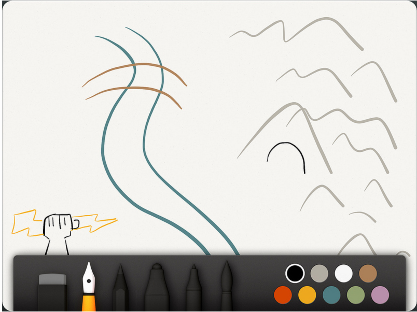
Paper by FiftyThree is an iPad drawing app that has garnered a lot of attention since being released. It has won numerous awards as well as the prestigious Apple's App of the year for 2012.

I want to talk about how videogame designers can learn a lot from Paper. No, I'm not talking about using it to create Keynote slides or anything like that. I'm talking about the actual design choices they have made and how it relates to videogames.

Do One Thing and Do It Well

Screen Shot 2013-07-09 at 2.43.46 PM.png

Paper launched the same day the iPad retina was released. It had the benefit of looking beautiful when people were looking for apps to show off on their new device. The Verge even went so far to say it was the Instagram of drawing apps. With or without skill your drawings were going to look better than ever before.

It broke tradition in comparison to other drawing apps which overwhelmed the user with tons of choices. Which type of brush to use, what size of the brush, what color, etc. Paper launched with a lack of options. A free app that only gave you pen and a handful of colors to play around with.

When it launched it also was one of the first apps to attempt In App Purchasing and not be a game. The IAP was for the various 'tools' that the user could purchase. One of the great things they did with this was really call out each individual tool (Draw, Sketch, Outline, Write, and Color) as something special. People wanted to own all of the tools because they felt unique and different from one another.

This is something we as designers have done a bad job of - although we are slowly getting better. Name things! Build things up so that people want them. The 'Boomer' in Gears of War is no different than most enemies in games but he is built up, has a cool name, etc so that people remember him. Same with Clickers and Bloaters in The Last of Us. Take the time to name things in your game and make everything feel special and important. Think about how they would all make cool action figures and play sets.

Another great thing they did with their IAP is give the user a place to actually try the tool before they bought it. They bring up a window and let the player play with the Pencil or Outline tool before purchasing it. This would be like letting someone play with a character for a small amount of time or even a level before deciding if they want to purchase it or not.

Steal & Make it Yours

Building along the famous phrase, 'good artists copy great artists steal' FiftyThree have done an amazing job of this. Again, this is something that we as game designers need to do more of. Great ideas can be found everywhere! For example in God of War we looked at Track & Field along with Jet Set Radio for our button inputs.

Rewind

Screen Shot 2013-07-09 at 2.46.52 PM.png

Taking inspiration from how 'jog dials' in video editing work they modified it to be 2 fingers together and by simply going in a clockwise / counter clockwise direction the user could undo / redo. This allows the user to not really care so much about where exactly the undo button is and instead keep their focus on the drawing. Make a stray line? Simply hold the stylus off to the side and quickly rewind and go back to your creation.

Color Mixing

1671356-slide-color-mixer.jpg

When the app was first released - they were panned often about the lack of color choices. The simple answer would have been to give the user a color picker, something found in almost every other drawing app. FiftyThree instead chose to take their time and find a unique answer to a common problem.

They launched their Color Mixer about a year after launching the app. Which is basically an eternity within the iOS App Store. Their solution basically takes the Rewind gesture that people were already using but now making it 1 finger and emulating how it is to mix colors in a paint can.

Make sure to check out the color articles that FastCompany did. I link them below.

Zoom

zoom_large_verge_medium_landscape.png

Arguably the second most common complaint I'm sure they received aside from lack of color options was the ability to zoom. I don't know their time frame on this one but I imagine it took them a very long time as well. Their solution is again, pure genius. They took a real world object that people use to see closer in photos - the loupe and figured out how to make it work for a drawing app.

The loupe uses the common pinch to zoom gesture that anyone using an iOS device knows. This allows the user to keep their head down and focused on their creation and use their other hand to zoom in quickly, draw, and zoom back out.

Conclusion

FiftyThree have done an amazing job of releasing an app in a crowded market and not only doing well but also succeeding. Adobe's VP of Experience Design named it as his most depended app. Don't forget that Adobe makes drawing apps on the iPad as well!

The app has had a strong design voice from the very beginning. They didn't just overwhelm the user with a ton of choices; the app guides the user down a specific path with the lack of choices and options. Instead of rushing out with new options inspiration was found from outside what is considered a normal drawing app. Compare this to how Gears of War was inspired from the golf swing mechanic and used as their reload mechanic.

Last but not least - they have been fantastic about talking in detail how they make their product. I highly recommend reading some of the links below: